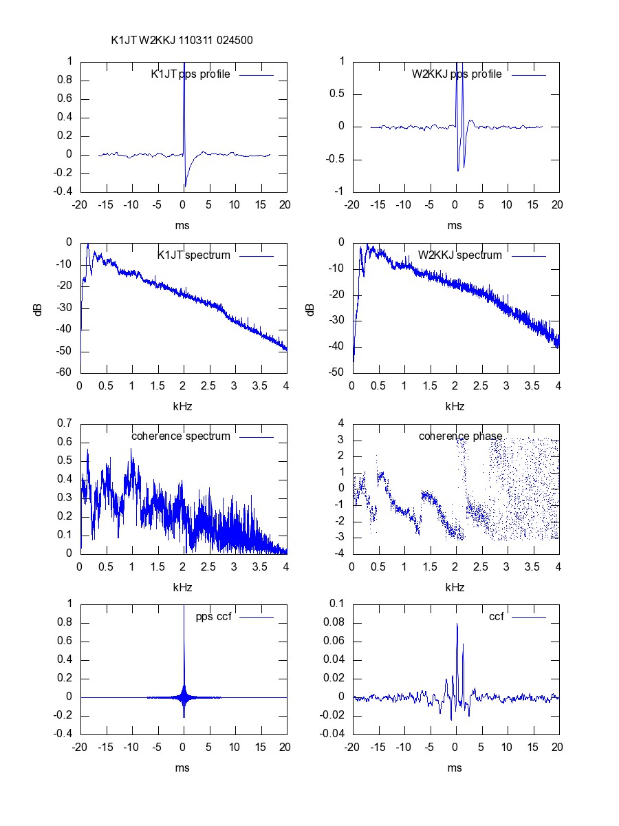
A typical cross-correlation analysis page displays key information obtained by comparing two 1 pps time-tagged audio streams recorded at two receiving locations. Example:

Sample Analysis of W1AW data received at K1JT and W2KKJ (K1JT figure)
The plots, reading left to right from the top:
1. PPS pulse for station 1
- This is the result of folding the received data on itself with a 1 second offset, picking up the GPS-derived 1 pps signal and averaging out most of the other audio signal. (We also solve for the true sound card sampling rate.)
2. PPS pulse for station 2
- Same for the second receiving station. Note abnormal double pulse at W2KKJ. (A mystery thus far.)
3. Average spectrum at station 1
- Audio power spectrum of first station. The roll off may be due to the receiver passband or to the source spectrum. (Note that we are receiving an SSB signal using AM detectors, which will probably give low-frequency emphasis.)
4. Average spectrum at station 2
- Same for second receiving station.
5. Calibrated coherence spectrum (amplitude)
- Amplitude part of cross power spectrum of receiver 1 with receiver 2. Helps to show which part of analog spectrum shows a common signal at both receivers. If the receiving stations were listening to difference signals or widely different frequencies, the coherence only be noise.
6. Calibrated coherence spectrum (phase)
- Phase part of cross power spectrum. Those sections showing good signal to noise (up to about 2.2 kHz in this case) also indicate good coherence between receivers.
7. PPS cross correlation
- Cross-correlation between the 1pps signals at both stations. Has to be "perfect" because of analysis procedure.
8. W1AW cross correlation
- Cross-correlation, which is the Fourier transform of #5 and #6 above. In the case of simple propagation and good signal to noise, we expect a sharp peak at a time offset determined by the difference in time of arrival of the signal from W1AW. In this case we see multiple peaks, which could be partly instrumental (see plot #2) and partly because there are two propagation paths, e.g., single and double hop paths.